Role
Product Design, Data Visualization Specialist
Focus
Data Viz, UI/UX, Design System
Team
PM, Data Engineers, Scientists, Frontend Dev
Duration
12 Months
02 / Define
Start with Data
Whenever I work on a data visualization project, I start by examining the nature of the data—its metadata, format, dimensions, and relationships.
These pillars provide insights into different dimensions of how trustworthy a company is perceived by the public, helping users understand which areas are driving or detracting from overall trust.
Ability
The perception that an organization is skilled and proficient at its core functions and responsibilities.
Dependability
The expectation that an organization will consistently act with integrity and keep its commitments to stakeholders.
Integrity
The conviction that an institution is honest and morally upright in its dealings and communication.
Purpose
The sentiment that an organization is actively striving to have a positive impact on society and contribute to its well-being.
04 / Delivered Feature
Performance
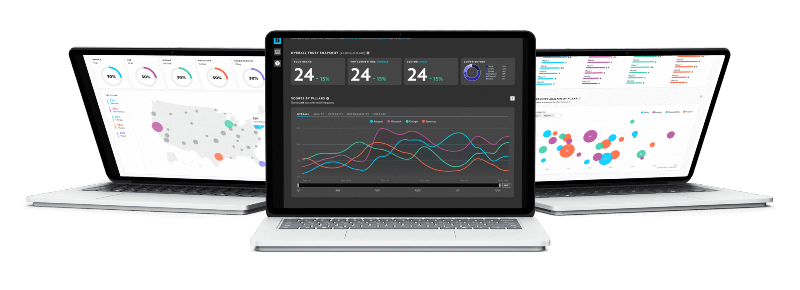
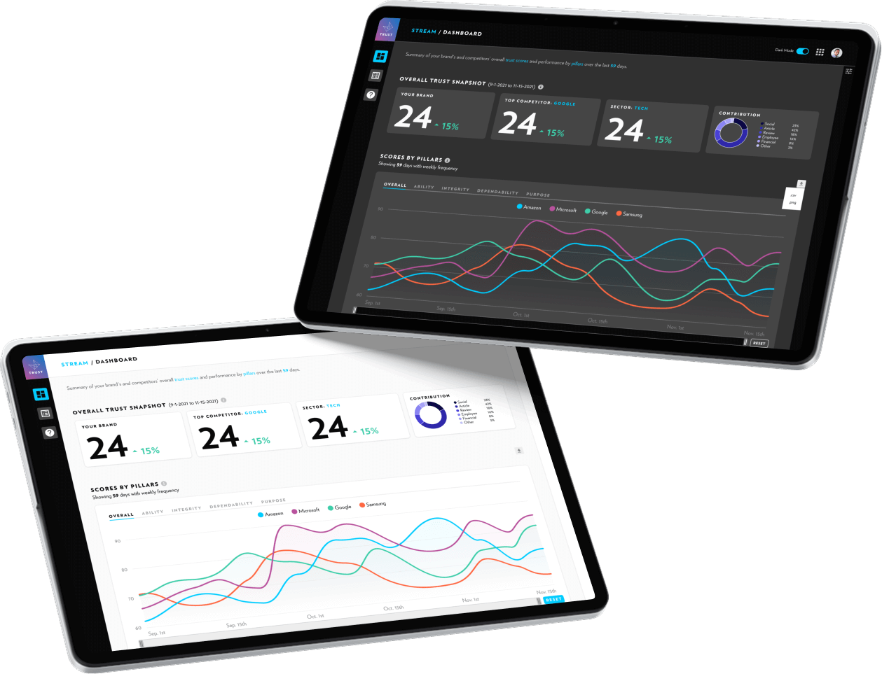
The Performance gives users a clear snapshot of their brand’s trust score performance. By overlaying competitors, users can benchmark results, highlight strengths, and pinpoint areas for improvement.
1. Scores by Pillar
Time-based line charts are used to highlight how trust scores evolve over time, since line charts clearly communicate trends and trajectories.
The tooltip appears on hover, provides the actual number.
Users can toggle between the pillars through tabs at the top, since it’s rare to need multiple pillars at once. This approach is both space-efficient and more focused than showing five separate charts, while still allowing users to explore each dimension in detail.
2. Benchmarking
Each selected brand is color-coded, making comparisons intuitive while keeping the visualization clear. Users can toggle lines on or off to reduce clutter and focus on what matters, striking a balance between clarity and interactivity.
3. Scores by Brands
By optimizing space, I suggested pivoting the data to tell the story from a different angle—comparing all pillars side by side with a focus on brand.
This approach enables users to easily spot trends and relationships across pillars, making it simpler to identify correlations, outliers, and shifts in trust dynamics over time.
4. Summary
The page ends with a table as a summary to show the net performance in both dimensions—brands and pillars.
Clicking the “View More” button opens a secondary page with a detailed list of articles influencing the brand within a specific pillar, allowing users to dive deeper into the content and uncover the stories driving shifts in trust.
2. Detail View
In detail view, I designed an enhanced version of the histogram to serve multiple purposes.
On hover, it reveals the exact number of articles in each bin.
Finally, each bar is interactive—when clicked, it filters the table results, enabling users to easily narrow down and focus on the most relevant articles.
