Data Visualization_$10 Trillion Prize

$10 Trillion Prize

Through constant communications with the client, I was able to gain an understanding of the major goal of the project – design an interactive data visualization tool to illustrate the Chinese and Indian consumer spending in 2010 and 2020 in seven major categories and three income classes. By using Storyboard, I successfully demonstrated the complicated relationship in an interactive way.

Client: Boston Consulting Group
Services: UI / UX Design, Data Visualization
Live Link

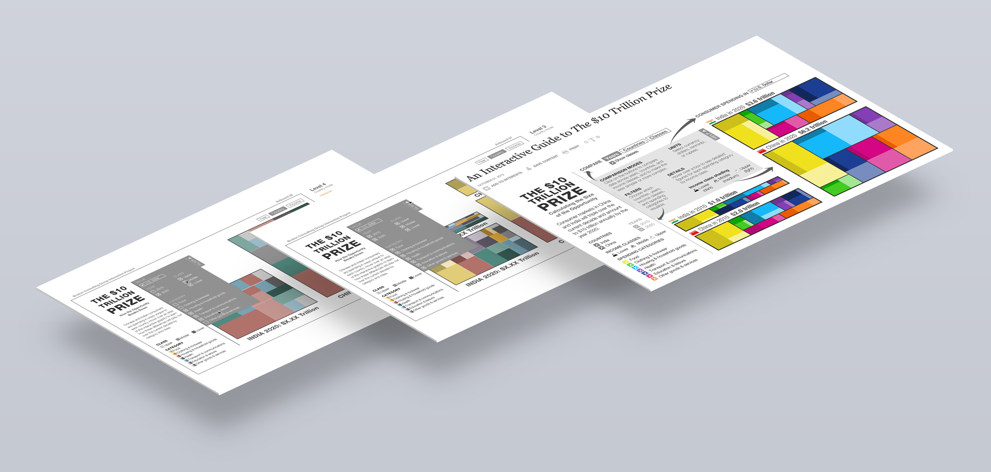
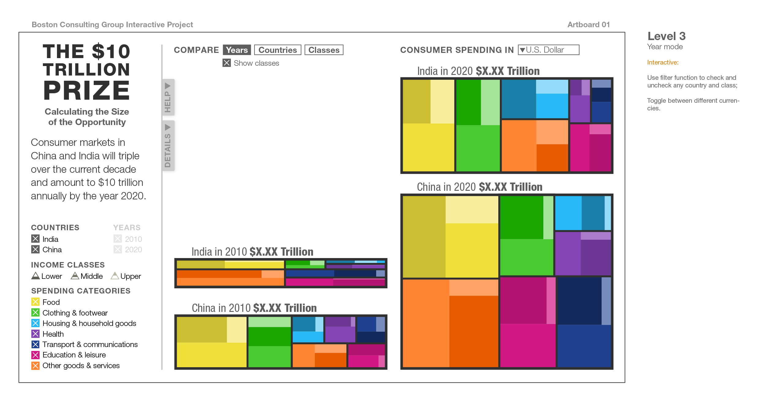
Storyboard is used to demonstrate interactive features and functions of different parts of the interface. I chose treemap as the main form of visualization, because its effectiveness in showing attributes of hierarchical data using size and color coding, which represent spending and category respectively.

Beginning Stage with Instructions
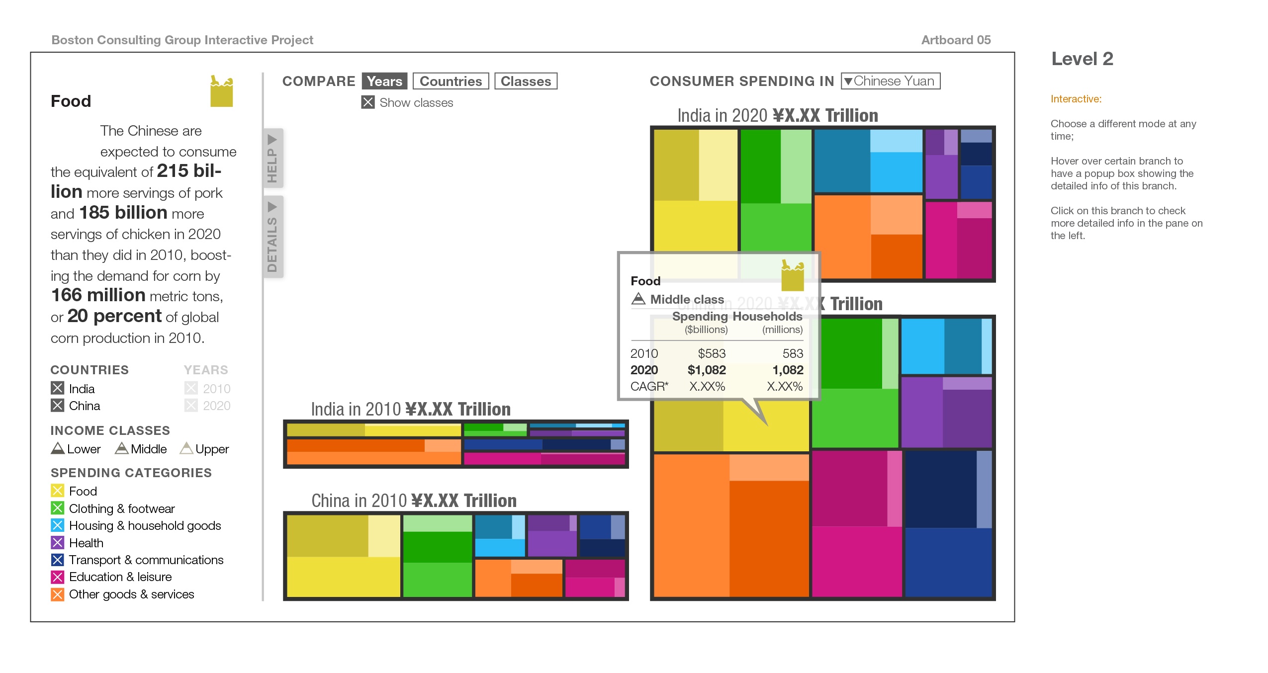
Hovering stage
Filters: Spending Categories
Filters: Class and Country

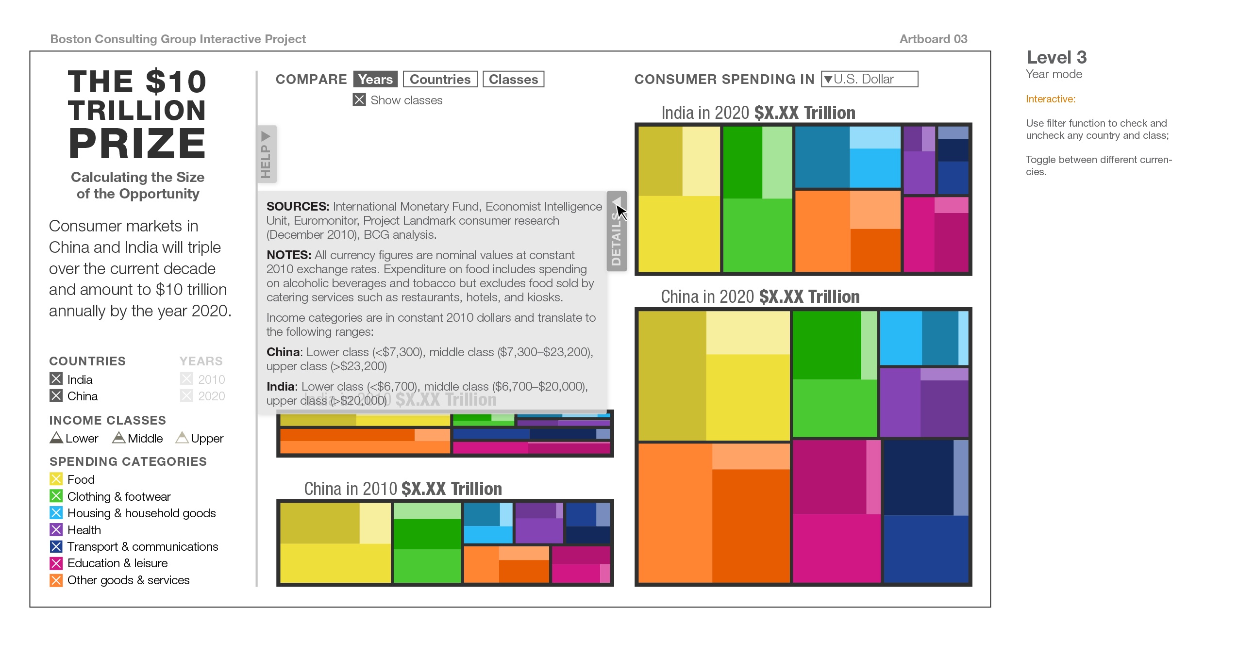
Additional Information